Designing Logo Assets for a NighTool Tool Website
Main Text
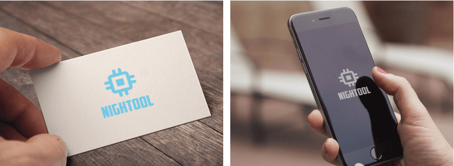
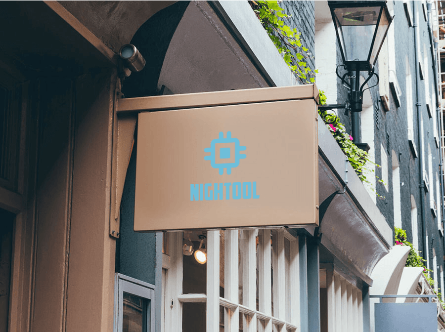
During this holiday, I have been learning how to use various design software and continuously designing logo icons for some of my websites. Not long ago, I created an online toolbox called NighTool (it has not been officially released yet, so I will not share the URL for now), and I wanted to design a high-end, impressive logo for it. After thinking it over and tinkering around for several hours, I came up with the following renderings. If you like them, please give them a thumbs-up!
Design Concept
As the name suggests, NighTool is an online tool, something related to technology, so I chose blue, because of its associations with the Chinese Dream and “Dream Blue.” Blue represents the development of new technologies. It is also comprehensive, which means it should be accessible from all directions, so I chose a quadrilateral. Adding some lines to the quadrilateral makes it look like a circuit board (well, sort of), and filling the center with a certain something makes the whole thing look like a CPU (central processing unit). Yes, this is exactly the effect I wanted. Alright, that is enough rambling for now; I will get back to studying. Wahahaha!
Comments
(0)No comments yet. Start the conversation.