Main Text
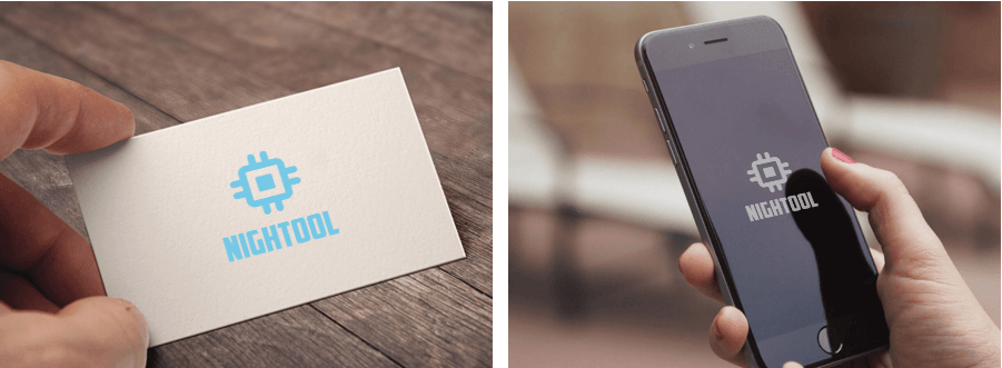
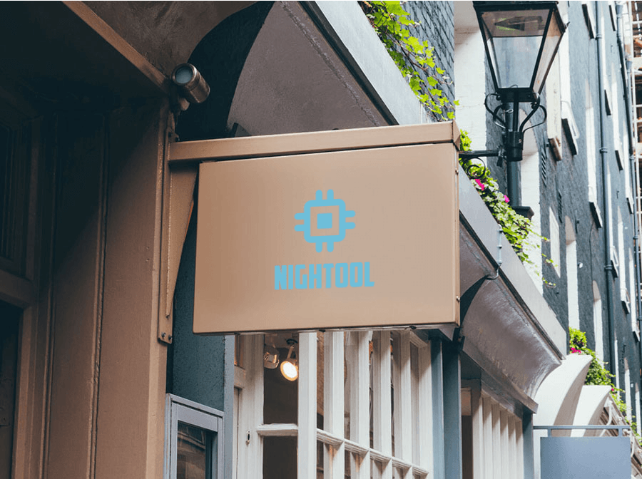
This holiday, I have been learning how to use various design software and continuously designing some Logo icons for my websites. Not long ago, I made an online toolbox called NighTool (it has not been officially released yet, so I will not post the address), and I wanted to design a high-end, impressive Logo for it. After thinking it over and messing around for several hours, I created the following renderings. If you like them, please give them a thumbs-up!
Design Concept
As the name suggests, NighTool is an online tool, something technological, so I chose blue because of the connotations of the Chinese Dream and Mengzhilan; blue represents the development of new technology. It is also comprehensive, which means it is connected in all directions, so I chose a quadrilateral. Adding some lines to the quadrilateral makes it look like a circuit board (not really), and filling the middle with a certain something makes the whole thing look like a CPU (central processing unit). That’s right, this is the effect I wanted. All right, that’s enough rambling for now—I’m going back to studying. Hahaha!